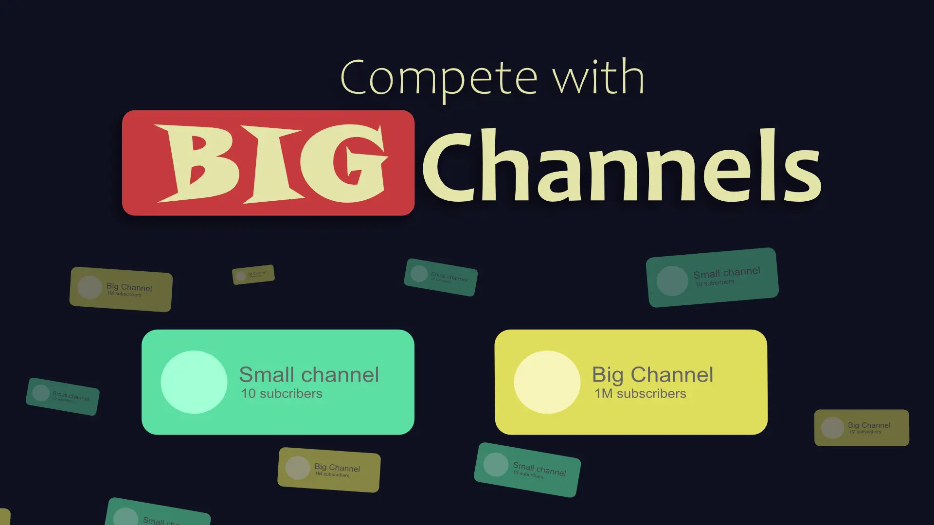
How Small YouTubers Can Compete with Big Channels Through Better Thumbnails
How Small YouTubers Can Compete with Big Channels Through Better Thumbnails
You upload a video, check back in 24 hours, and see 47 views. Meanwhile, a big channel's similar video has racked up 50,000 views in the same timeframe. Sound familiar?
Here's the reality: Big channels have production budgets, full-time teams, and massive brand recognition. But there's one crucial area where small creators can compete on completely equal footing: thumbnails.
On the YouTube homepage, everyone's thumbnail is the same size. Viewers make decisions in 1-2 seconds based purely on visual appeal, not subscriber count. This is your opportunity to level the playing field.
This guide will show you exactly how to create thumbnails that compete with—and sometimes outperform—channels with millions of subscribers.
Why Thumbnails Are the Great Equalizer
Think about scrolling through YouTube. When you see a video in your feed or search results, the thumbnail appears at exactly the same size whether it's from MrBeast or someone with 100 subscribers.
This is incredibly powerful. In that critical 1-2 second decision window, viewers aren't thinking about channel size. They're responding to:
- Visual impact and clarity
- Emotional appeal
- Curiosity triggers
- Relevance to their needs
The Psychology Behind It
Human brains process images 60,000 times faster than text. When someone scrolls through YouTube, their subconscious is doing split-second evaluations:
- Does this look interesting?
- Does this solve my problem?
- Does this spark curiosity?
- Can I trust this?
âœ" Curiosity beats celebrity every single time. A well-designed thumbnail from a small channel can generate more clicks than a mediocre one from a big creator.
Real Success Stories
Small channels are proving this daily. A tech tutorial channel went from 200 views per video to 50,000+ views by implementing strategic thumbnail changes—without changing their content quality or upload schedule.
The difference? They started designing thumbnails that competed visually with the top results in their niche.
What Big Channels Do Right (That You Can Copy)
Let's break down the proven thumbnail strategies that major channels use—strategies you can implement today without a design team.
High Contrast and Bold Colors
Big channels understand that thumbnails need to pop against YouTube's interface. They use:
- Vibrant, saturated colors that stand out
- High contrast between background and foreground
- Strategic use of complementary colors (blue/orange, red/green)
You can do this: Pick 2-3 bold colors and stick with them consistently. Avoid muddy, muted tones that blend into the background.
Text That's Readable on Mobile
Over 70% of YouTube watch time happens on mobile devices. Big channels follow the 3-5 word rule:
- Keep text under 5 words maximum
- Use thick, bold fonts
- Ensure text is readable at thumbnail size (156x88 pixels)
- High contrast between text and background
If you can't read your text on a mobile phone, your thumbnail isn't working.
Faces with Exaggerated Expressions
YouTube's own data shows that thumbnails with faces get 154% more clicks. Big channels take this further:
- Exaggerated facial expressions (surprise, shock, excitement)
- Direct eye contact with the camera
- Close-up shots that show emotion clearly
- Reactions that match the video's content
Why it works: Humans are hardwired to respond to faces and emotions. We instinctively look at faces before anything else.
Consistent Branding
Every successful channel has visual consistency:
- Same fonts across all thumbnails
- Consistent color palette
- Recognizable layout or style
- Logo or channel branding element
This builds visual brand recognition. After seeing 2-3 of your videos, viewers should recognize your thumbnails instantly.
Clear Focal Point
Professional thumbnails have one dominant element that grabs attention:
- A single large image or face
- One bold text statement
- Strategic use of arrows or visual cues
- Minimal background clutter
The rule: If your thumbnail has more than 3 elements, it's too busy.
Where Small Channels Can Actually WIN
Here's where it gets exciting. Small channels have unique advantages that big channels can't replicate.
Authenticity Over Polish
While big channels often use professionally staged photos and elaborate setups, viewers increasingly crave genuine, authentic content.
- Your real reactions resonate more than scripted ones
- "Real person" thumbnails build stronger connections
- Authenticity signals trustworthiness
- Less polish can mean more relatability
âœ" Don't try to look like a big production. Lean into your authentic voice and presentation.
Niche Specificity
Big channels cast wide nets. You can use a laser:
- Target exact pain points big channels miss
- Use niche-specific language that resonates deeply
- Address specialized topics too small for big channels
- Build authority in your specific corner
Example: Instead of "Photoshop Tips" (broad), use "Fix Blown Out Wedding Photos" (specific). Your niche audience will click on the specific solution every time.
Faster Adaptation
You can pivot and experiment without:
- Committee approvals
- Brand guideline restrictions
- Risk-averse stakeholders
- Contractual obligations
Test wild thumbnail ideas. Try different styles. Iterate quickly. Your agility is a massive competitive advantage.
Personal Connection
In a niche, your face becomes familiar faster:
- Viewers recognize you after 3-4 videos
- Personal brand builds faster in smaller communities
- Direct engagement creates loyalty
- You become "their" creator
Creative Risks
Big channels play it safe. You don't have to:
- Experiment with unconventional designs
- Try bold, attention-grabbing concepts
- Test controversial (but ethical) approaches
- Break away from industry norms
The Small Channel Thumbnail Strategy
Let's get tactical. Here's your step-by-step approach to creating thumbnails that compete.
Strategy 1: Clarity Over Complexity
The principle: One clear message beats multiple competing ideas.
Implementation:
- Choose ONE main benefit or curiosity hook
- Remove everything else
- Make that one element impossible to miss
- Test if a 10-year-old could explain your thumbnail in one sentence
Complex, cluttered designs work for established brands. They kill small channel CTR.
Strategy 2: Promise Specificity
Generic promises get ignored. Specific promises get clicks.
Instead of this:
- "Audio Tips"
- "Photoshop Tutorial"
- "Cooking Ideas"
Do this:
- "Fix Audio Lag in OBS (2 Minutes)"
- "Remove Anything from Photos (No Clone Stamp)"
- "Crispy Chicken Thighs Every Time"
Why it works: Specificity signals that you have a real solution, not just general information.
Strategy 3: Use Contrast to Your Advantage
Study the top 10 results for your target keywords. What colors do they use?
Then do something different.
- If everyone uses blue backgrounds, use orange
- If everyone has dark thumbnails, go bright
- If everyone shows products, show faces
âœ" Stand out in the sidebar and homepage by being visually distinct from the competition.
Strategy 4: Leverage Your "Underdog" Status
Being small can actually be a selling point:
- "Small Channel Tutorial"
- "No-Budget Method"
- "Real Results from a Regular Creator"
- "Before I Had a Team"
People root for underdogs. They want to support creators they can relate to.
Strategy 5: Master Text Hierarchy
When you do use text:
Main text:
- 3-4 words maximum
- Huge and bold
- Most important word should be largest
Subtitle (optional):
- Smaller, supporting context
- Different color or style
- Adds clarity without cluttering
Example:
- Main text: "DOUBLE Your Views"
- Subtitle: "thumbnail strategy"
Practical Design Tips for Limited Resources
You don't need expensive software or a design degree. Here's how to create professional thumbnails on a budget.
Free and Affordable Tools
Canva (Free):
- Pre-made templates you can customize
- Easy drag-and-drop interface
- Mobile app for quick edits
- ==Perfect for beginners==
Photopea (Free):
- Browser-based Photoshop alternative
- Full professional features
- No subscription required
- Supports PSD files
AI Thumbnail Generators:
- Create professional thumbnails in seconds
- Generate multiple variations automatically
- Test different concepts quickly
- Optimize for click-through rates
Pro tip: Start with AI-generated thumbnails, then customize them to add your personal touch and branding.
Time-Saving Workflow Hacks
Create a Template System:
- Design 3-5 base templates with your:
- Brand colors
- Font choices
- Logo placement
- Standard layouts
- For each video, simply:
- Swap in your photo/screenshot
- Update the text
- Export and upload
Batch Creation:
- Take all your thumbnail photos in one session
- Use the same lighting and backdrop
- Create multiple thumbnails at once
- Build a backlog for future videos
Consistency Elements:
- Same photo background/setting
- Identical font pairings
- Standard text placement
- Recurring visual elements
âœ" A good template system can reduce thumbnail creation time from 30 minutes to 3 minutes per video.
Mobile-First Design Philosophy
Remember: 70%+ of viewing happens on mobile devices.
Your workflow:
- Design your thumbnail
- ==View it on your actual phone==
- Ask yourself:
- Can I read all the text?
- Does one element grab my attention?
- Would I click this?
- If not, simplify and repeat
If it doesn't work on mobile, it doesn't work period.
The Screenshot Strategy
Some of the highest-performing thumbnails use this simple approach:
- Take an interesting screenshot from your video
- Add high-contrast text
- Optionally add your face in a circle
- Done
Why it works: The screenshot proves your video delivers on the promise while requiring minimal design skills.
Testing & Optimization
Great thumbnails aren't created—they're discovered through testing.
Quick Wins You Can Implement Today
Audit Your Existing Content:
- Check the CTR (click-through rate) on your last 10 videos
- Identify your worst performers (CTR under 3%)
- Create new thumbnails for those videos
- Wait 48 hours and check if CTR improves
You can change thumbnails on existing videos! Many creators don't realize this is allowed and encouraged.
Competitive Analysis:
- Search your target keyword
- Screenshot the top 10 thumbnails
- Compare yours to the top results
- Identify what they're doing differently
- Adapt (don't copy) their successful elements
Community Feedback:
- Share thumbnail options with your audience
- Ask which one they'd click
- Test in relevant Facebook groups or Reddit
- Get honest feedback before publishing
Metrics That Actually Matter
Click-Through Rate (CTR):
- 2-4% = Poor (needs immediate improvement)
- 4-6% = Average (room for optimization)
- 6-10% = Good (above average)
- 10%+ = Excellent (replicate this approach)
CTR varies by niche. Educational content often has higher CTR than entertainment.
When to Change Thumbnails:
âœ" After 48 hours if CTR is below your channel average
âœ" After 7 days if video has significantly underperformed
âœ" Never change a thumbnail that's already working well
What to Track:
- Which thumbnail styles get the highest CTR
- What colors perform best in your niche
- Whether faces or graphics work better
- How text length impacts performance
- Time of day and thumbnail performance correlation
The A/B Testing Approach
Simple method:
- Create 2-3 thumbnail variations for important videos
- Upload with one thumbnail
- After 24-48 hours, switch to version 2
- Compare CTR between versions
- Keep the winner
Advanced method:
- Use thumbnail split-testing tools
- Create systematic experiments
- Test one variable at a time (color vs. text vs. layout)
- Build a database of what works for your channel
Common Mistakes That Hurt Small Channels
Avoid these thumbnail killers that specifically impact smaller creators:
Mistake 1: Copying Big Channels Exactly
The problem: You don't have their brand recognition.
When MrBeast uses a simple reaction face, viewers already know his content is high-quality. When you use the same approach without the brand equity, viewers scroll past.
The solution: Study what big channels do, but adapt it to your context and strengths.
Mistake 2: Using Too Much Text
The problem: Text becomes illegible on mobile.
Small creators often try to cram too much information into thumbnails, thinking more detail = more clicks.
The solution: Use 3-5 words maximum. If you need more context, let your title do the work.
Mistake 3: Generic Stock Photos
The problem: Stock photos scream "low effort" and "impersonal."
Viewers can instantly recognize stock imagery, which damages trust and authenticity.
The solution: Use real screenshots from your video or photos of yourself. Even a smartphone photo is better than a stock image.
Mistake 4: Inconsistent Branding
The problem: Viewers can't recognize your content.
If every thumbnail looks completely different, you're starting from zero with every video.
The solution: Create 2-3 template styles and rotate them. Build visual consistency over time.
Mistake 5: Clickbait That Doesn't Deliver
The problem: Kills watch time and destroys channel growth.
A misleading thumbnail might get the click, but YouTube's algorithm punishes videos where viewers immediately leave.
High CTR + low watch time = Algorithm death. Your video gets buried.
The solution: Make your thumbnail an accurate, exciting representation of your actual content.
Mistake 6: Ignoring Thumbnail Dimensions
The problem: Thumbnails that look good in design software but break on YouTube.
The solution:
- Always design at 1280x720 pixels
- Maintain 16:9 aspect ratio
- Keep important elements in the center (avoid edges)
- Export as JPG or PNG under 2MB
Mistake 7: Following Trends Blindly
The problem: Trend-chasing without considering your specific audience.
What works in gaming might not work in personal finance. What works for vlogs might not work for tutorials.
The solution: Study trends in your specific niche, not YouTube broadly.
Real Before & After Examples
Let's look at practical transformations:
Example 1: Tech Tutorial Channel
Before:
- Generic computer screenshot
- Small text: "How to Speed Up Windows"
- Low contrast colors
- No face or human element
- CTR: 2.1%
After:
- Creator's face showing surprise/excitement
- Bold text: "10x FASTER"
- Subtle subtext: "Windows optimization"
- High contrast (orange text on blue background)
- Clear before/after visual indicator
- CTR: 8.7%
Why it worked: Added human element, simplified message, increased contrast, created curiosity.
Example 2: Cooking Channel
Before:
- Finished dish photo
- Text: "Easy Dinner Recipe"
- Standard lighting
- CTR: 3.4%
After:
- Mid-cooking action shot with steam
- Text: "30-MIN WONDER"
- Vibrant, saturated colors
- Creator's excited face in corner
- Time promise clearly visible
- CTR: 9.2%
Why it worked: Action over result, specific time promise, added personality, dynamic composition.
Example 3: Personal Finance Channel
Before:
- Stock photo of money
- Text: "Save Money Tips"
- Professional but boring
- CTR: 2.8%
After:
- Creator pointing at bold number: "$5,273"
- Text: "I SAVED THIS"
- Authentic, real-person vibe
- Story-driven approach
- CTR: 7.9%
Why it worked: Specific, provable result + authentic presentation + curiosity about method.
Advanced Strategies
Once you've mastered the basics, try these advanced techniques:
The Pattern Interrupt
Use unexpected elements that break viewer expectations:
- Unusual angles or perspectives
- Surprising color combinations
- Contrarian statements
- Visual paradoxes
Example: If every fitness thumbnail shows muscular bodies, show your "before" photo with text: "Still Got Results"
The Question Framework
Thumbnails that pose questions in viewer's mind perform exceptionally well:
- "How did this happen?"
- "What's the secret?"
- "Is this real?"
- "Can I do this too?"
âœ" Create visual curiosity gaps that only watching can resolve.
The Emotional Amplification
Go bigger with emotions than feels natural:
- More surprised than normal
- More excited than comfortable
- More skeptical than realistic
Why: Thumbnails that show moderate emotion get ignored. Exaggerated (but genuine) emotion cuts through.
The Negative Space Strategy
While others fill every pixel, strategically use empty space to:
- Draw focus to your main element
- Create sophisticated, clean designs
- Stand out from cluttered competitors
- Improve mobile readability
The Series Approach
Create thumbnail families for video series:
- Consistent border or frame
- Number indicators
- Matching color schemes
- Progressive visual elements
Benefits: Viewers binge-watch, algorithm rewards session time, builds anticipation for next episode.
Your Thumbnail Action Plan
Here's your step-by-step plan to start competing today:
Week 1: Foundation
- ✅ Audit your current thumbnails and note patterns
- ✅ Identify your 3 brand colors
- ✅ Choose 2 font families (one bold, one readable)
- ✅ Create your first template in Canva or similar tool
- ✅ Take 10-20 thumbnail photos with good lighting
Week 2: Implementation
- ✅ Create new thumbnails for your 3 worst-performing videos
- ✅ Design thumbnails for your next 3 videos using your template
- ✅ Test thumbnails on your phone before publishing
- ✅ Ask for feedback from your community
- ✅ Monitor CTR changes on updated videos
Week 3: Optimization
- ✅ Compare which thumbnail styles got highest CTR
- ✅ Study top 10 competitors in your niche
- ✅ Iterate on your template based on data
- ✅ Create thumbnail variations for testing
- ✅ Document what works for future reference
Week 4: Systematization
- ✅ Refine your template to your 3 best-performing styles
- ✅ Create a thumbnail checklist you follow every time
- ✅ Set up batch creation workflow
- ✅ Build library of reusable elements
- ✅ Establish your unique thumbnail signature
Remember: This is a marathon, not a sprint. Thumbnail mastery takes time, but each improvement compounds.
The Truth About Competition
Big channels aren't your enemy—they're your inspiration and proof of what's possible.
Here's what matters:
You don't need to beat MrBeast. You need to beat the other small channels in your niche and gradually expand your reach.
Every big channel started as a small channel with zero subscribers and no brand recognition. Their thumbnails worked because they understood the fundamentals we've covered in this guide.
Your advantages as a small channel:
- Authenticity resonates more now than ever
- Niche specificity beats broad appeal for small audiences
- Agility to test and iterate quickly
- Personal connection builds loyal communities
- Nothing to lose, everything to gain
The channels that grow aren't the ones with the biggest budgets—they're the ones that master fundamentals and execute consistently.
Final Thoughts: Your Thumbnail is Your Promise
Every thumbnail you create is making a promise to potential viewers:
- This video will solve your problem
- This content is worth your time
- This will be entertaining/educational/valuable
- You can trust this creator
The thumbnails that win are the ones that make clear, specific, believable promises.
Small channels can absolutely compete with big channels through superior thumbnails. You now have:
Understanding of thumbnail psychology
Practical design strategies
Resource-efficient workflows
Testing and optimization frameworks
Common mistakes to avoid
Real examples and proven tactics
Your next step: Don't just read this—implement it. Create one new thumbnail today using these principles. Post it. Track the results. Iterate.
Remember: Every creator you admire started exactly where you are. The difference between them and everyone else? They took action on what they learned.
What thumbnail strategy will you test first? Start today, track your results, and watch your small channel start competing with the big players.
Your thumbnails are the equalizer. Use them wisely.
Ready to level up your thumbnail game? Try our AI-powered thumbnail generator to create professional, high-converting thumbnails in seconds. Get started with a free trial and see how better thumbnails can transform your channel's growth.
Mustafa Qasim
Co-founder Stumbnail